Logo ~claire~
- crb0928
- Dec 18, 2019
- 1 min read

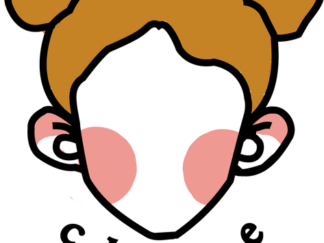
For my logo, I went witch a combination mark. I went with this because I really liked the minimal drawing of the face with the typewriter-esk font.
The reasoning behind my design is me. I took my face and went extremely minimal, also, I put my hair in space buns solely because it fits my crazy personality! And I went with my name so everyone could remember not only my face but my name as well.


Comments